18 from correlation to regression
In Chapter 22 of R4DS, Wickham introduces modeling as a complement to data visualization. At the beginning of Chapter 23, he points out that:
The goal of a model is to provide a simple low-dimensional summary of a dataset.
In the remainder of his section on modeling (Chapters 23 - 25), he presents an innovative approach to introducing models. Feel free to explore these. Our treatment, however, will deviate from this.
18.1 correlation
(This section is excerpted directly from From https://github.com/datasciencelabs)
Francis Galton, a polymath and cousin of Charles Darwin was interested, among other things, in how well can we predict a son’s height based on the parents’ heights.
We have access to Galton’s family height data through the HistData package. We will create a dataset with the heights of fathers and the first son of each family. Here are the key summary statistics for the two variables of father and son height taken alone:
library(HistData)
data("GaltonFamilies")
galton_heights <- GaltonFamilies %>%
  filter(childNum == 1 & gender == "male") %>%
  select(father, childHeight) %>%
  rename(son = childHeight)
galton_heights %>%
  summarise(mean(father), sd(father), mean(son), sd(son))
## mean(father) sd(father) mean(son) sd(son)
## 1 69.09888 2.546555 70.45475 2.557061This univariate description fails to capture the key characteristic of the data, namely, the idea that there is a relationship between the two variables:
galton_heights %>%
  ggplot(aes(father, son)) +
  geom_point(col  = 'forestgreen')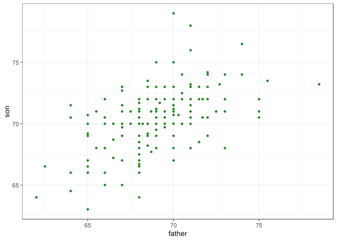
Figure 18.1: Heights of father and son pairs plotted against each other.
The correlation summarizes this relationship. In these data, the correlation (r) is about .50.
galton_heights %>%
  summarize(cor(father, son)) %>%
  round(3)
## cor(father, son)
## 1 0.50118.2 correlations based on small samples are unstable: A Monte Carlo demonstration
Correlations based on small samples can bounce around quite a bit. Consider what happens when, for example, we sample just 25 cases from Galton’s data, and compute the correlation from this. We repeat this 1000 times, then plot the distribution of these sample rs:
set.seed(33458) # why do I do this?
nTrials <- 1000
nPerTrial <- 25
replications <- replicate(nTrials, {
  sample_n(galton_heights, nPerTrial, replace = TRUE) %>% # we sample with replacement here
    summarize(r=cor(father, son)) %>%
    .$r
})
replications %>%
  as_tibble() %>%
  ggplot(aes(replications)) +
  geom_histogram(binwidth = 0.05, col = "blue", fill = "cyan")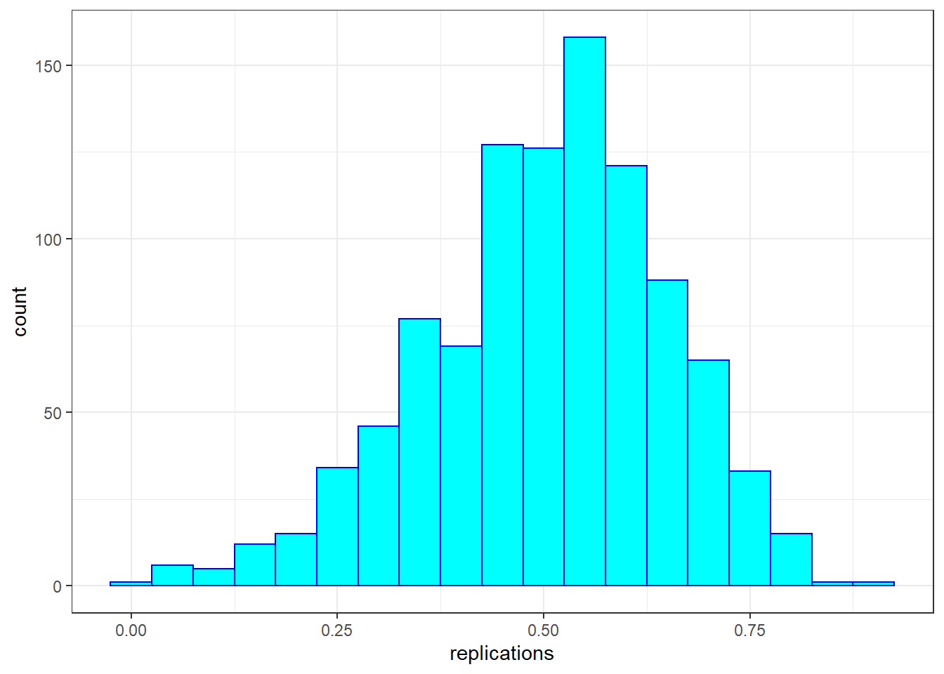
These sample correlations range from -0.002 to 0.882. Their average, however, at 0.503 is almost exactly that of the overall population. Often in data science, we will estimate population parameters in this way - by repeated sampling, and by studying the extent to which results are consistent across samples. More on that later.
18.2.1 The regression line
If we are predicting a random variable \(Y\) knowing the value of another \(X=x\) using a regression line, then we predict that for every standard deviation, \(\sigma_X\), that \(x\) increases above the average \(mu_X\), \(Y\) increases \(\rho\) standard deviations \(\sigma_Y\) above the average \(\mu_Y\), where \(\rho\) is the correlation between \(X\) and \(Y\). (Confusing, yes? Make sense of it by making it concrete: Let \(Y\) = College GPA, \(X\) = HS GPA, \(X = x\) = 3.2 … )
To manually add a regression line to a plots, we will need the means and standard deviations of each variable together with their correlation:
mu_x <- mean(galton_heights$father)
mu_y <- mean(galton_heights$son)
s_x <- sd(galton_heights$father)
s_y <- sd(galton_heights$son)
r <- cor(galton_heights$father, galton_heights$son)

m <-  r * s_y / s_x
b <- mu_y - m*mu_x

galton_heights %>%
  ggplot(aes(father, son)) +
  geom_point(alpha = 0.5) +
geom_abline(intercept = b, slope = m ) 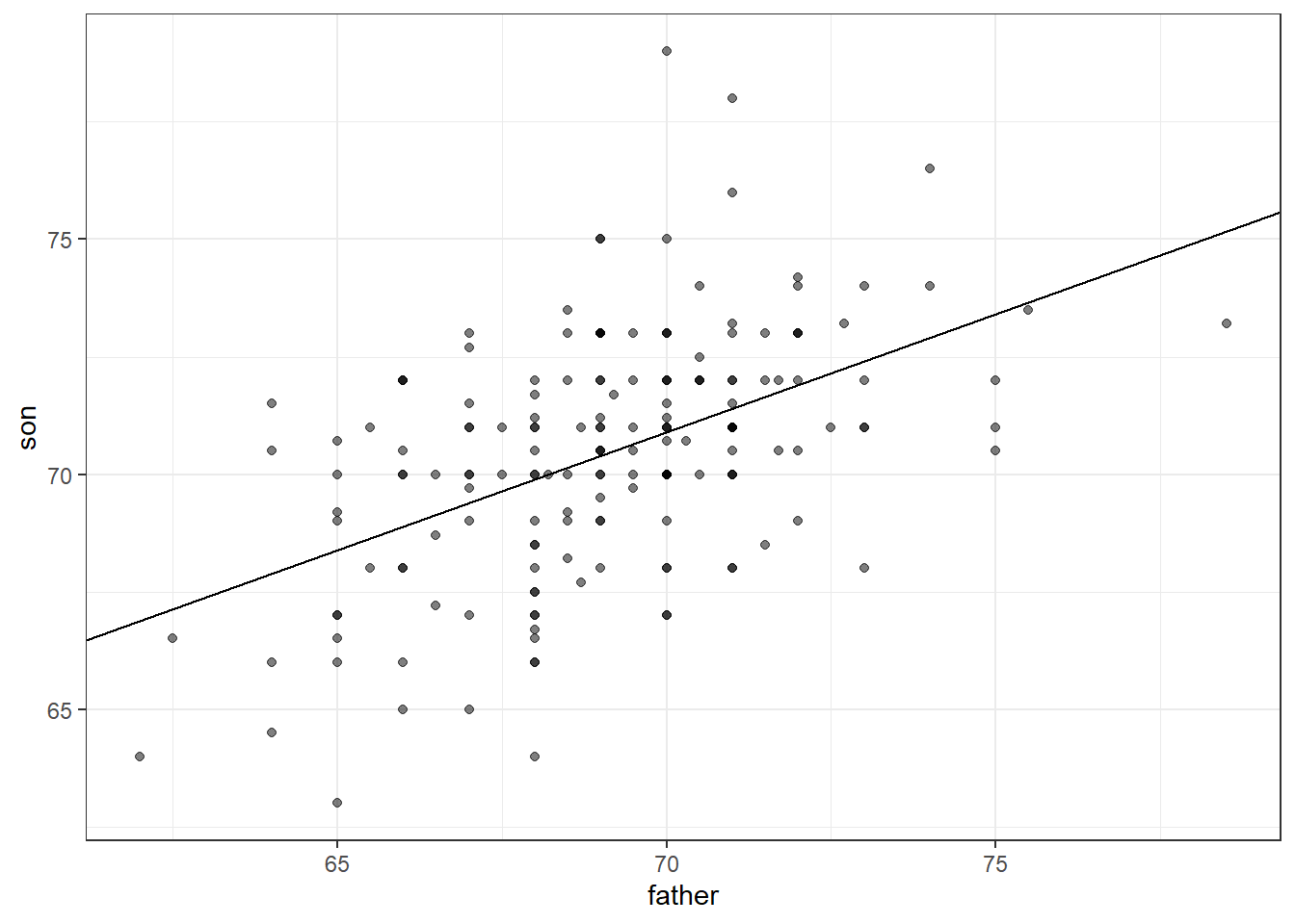
If we first standardize the variables, then the regression line has intercept 0 and slope equal to the correlation \(\rho\). Here, the slope, regression line, and correlation are all equal (I’ve made the plot square to better indicate this).
galton_heights %>%
  ggplot(aes(scale(father), scale(son))) +
  geom_point(alpha = 0.5) +
geom_abline(intercept = 0, slope = r) 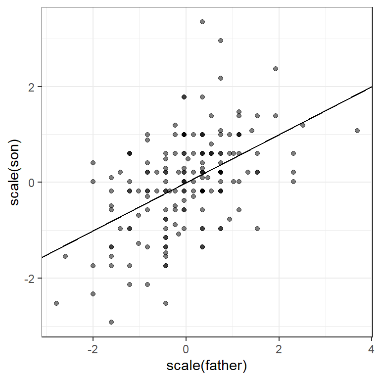
18.2.2 Warning: there are two regression lines
In general, when describing bivariate relationships, we talk of predicting y from x. But what if we want to reverse this? Here, for example, what if we want to predict the father’s height based on the son’s?
For this, the intercept and slope of the lines will differ
# son from father
m_1 <-  r * s_y / s_x
b_1 <- mu_y - m_1*mu_x
# vice-versa
m_2 <-  r * s_x / s_y
b_2 <- mu_x - m_2*mu_y
We will still see regression to the mean (the prediction for the father is closer to the father average than the son heights \(y\) is to the son average).
Here is a plot showing the two regression lines, with blue for the predicting son heights with father heights and red for predicting father heights with son heights.
galton_heights %>%
  ggplot(aes(father, son)) +
  geom_point(alpha = 0.5) +
  geom_abline(intercept = b_1, slope = m_1, col = "blue") +
geom_abline(intercept = -b_2/m_2, slope = 1/m_2, col = "red") 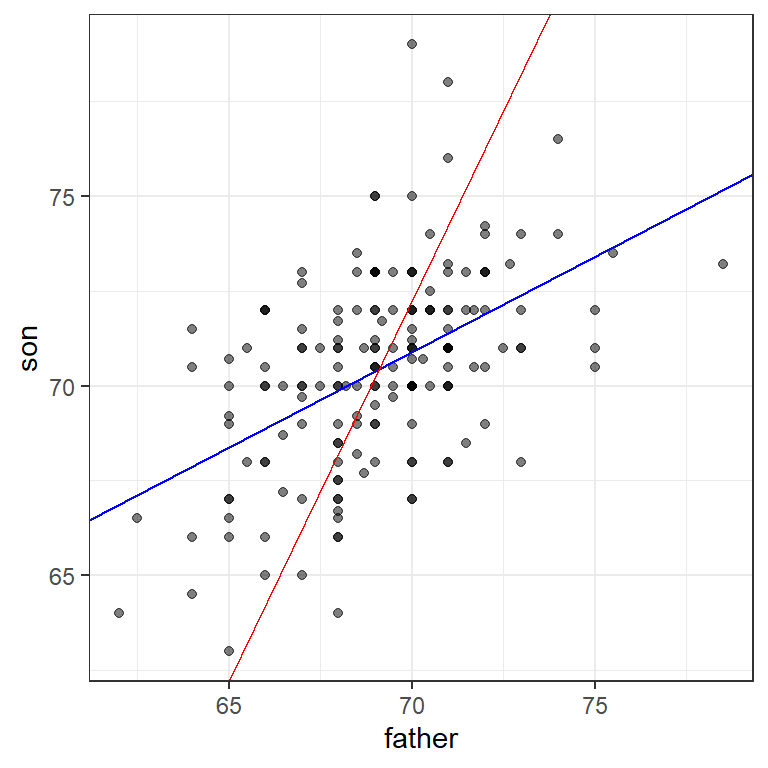
18.3 multiple regression
We extend regression (predicting one continuous variable from another) to the multivariate case (predicting one variable from many). We extend this logic to the cases where our variables are not normally distributed, as in the case of dichotomous variables (yes/no, true/false), as well as counts, which often are skewed.
(This section is drawn from Peng, Caffo, and Leek’s treatment from Coursera/ the Johns Hopkins Data Science Program. You may need to install the packages “UsingR,” “GGally” and/or“Hmisc”)
library(broom) # an older package for unlisting regression results
library(modelr)
library(GGally) # for scatterplot matrix
library(Ecdat) # Econometric data incl. affairs dataset
18.4 Swiss fertility data
To consider the multivariate case, we examine a second dataset.
data(swiss)
str(swiss)
## 'data.frame': 47 obs. of 6 variables:
## $ Fertility : num 80.2 83.1 92.5 85.8 76.9 76.1 83.8 92.4 82.4 82.9 ...
## $ Agriculture : num 17 45.1 39.7 36.5 43.5 35.3 70.2 67.8 53.3 45.2 ...
## $ Examination : int 15 6 5 12 17 9 16 14 12 16 ...
## $ Education : int 12 9 5 7 15 7 7 8 7 13 ...
## $ Catholic : num 9.96 84.84 93.4 33.77 5.16 ...
## $ Infant.Mortality: num 22.2 22.2 20.2 20.3 20.6 26.6 23.6 24.9 21 24.4 ...Here’s a scatterplot matrix of the Swiss data. Look at the first column of plots (or first row of the correlations). What is the relationship between fertility and each of the other variables?
ggpairs (swiss,
        lower = list(
            continuous = "smooth"),
        axisLabels ="none",
        switch = 'both')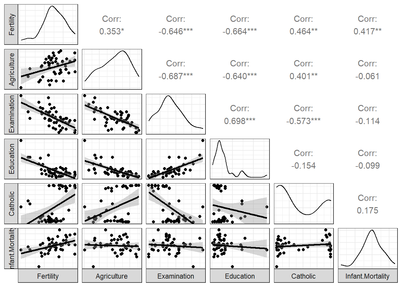
Here, we predict fertility from all of the remaining variables together in a single regression analysis, using the lm (linear model) command. As we saw in Chapter 15, the result of this analysis is a list. We can pull out the key features of the data using the summary() command. How do you interpret this?
swissReg <- lm(Fertility ~ ., data=swiss)
summary(swissReg)
##
## Call:
## lm(formula = Fertility ~ ., data = swiss)
##
## Residuals:
## Min 1Q Median 3Q Max
## -15.2743 -5.2617 0.5032 4.1198 15.3213
##
## Coefficients:
## Estimate Std. Error t value Pr(>|t|)
## (Intercept) 66.91518 10.70604 6.250 1.91e-07 ***
## Agriculture -0.17211 0.07030 -2.448 0.01873 *
## Examination -0.25801 0.25388 -1.016 0.31546
## Education -0.87094 0.18303 -4.758 2.43e-05 ***
## Catholic 0.10412 0.03526 2.953 0.00519 **
## Infant.Mortality 1.07705 0.38172 2.822 0.00734 **
## ---
## Signif. codes: 0 '***' 0.001 '**' 0.01 '*' 0.05 '.' 0.1 ' ' 1
##
## Residual standard error: 7.165 on 41 degrees of freedom
## Multiple R-squared: 0.7067, Adjusted R-squared: 0.671
## F-statistic: 19.76 on 5 and 41 DF, p-value: 5.594e-1018.5 marital affairs data
Here’s another dataset. We’ll apply ggpairs here, but for clarity will show only half of the data at a time. The dependent variable of interest (nbaffairs) will be included in both plots:
Fair1 <- Fair %>%
  select(sex:child, nbaffairs)
ggpairs(Fair1,
# if you wanted to jam all 9 vars onto one page you could do this
#        upper = list(continuous = wrap(ggally_cor, size = 10)),
         lower = list(continuous = 'smooth'),
         axisLabels = "none",
        switch = 'both')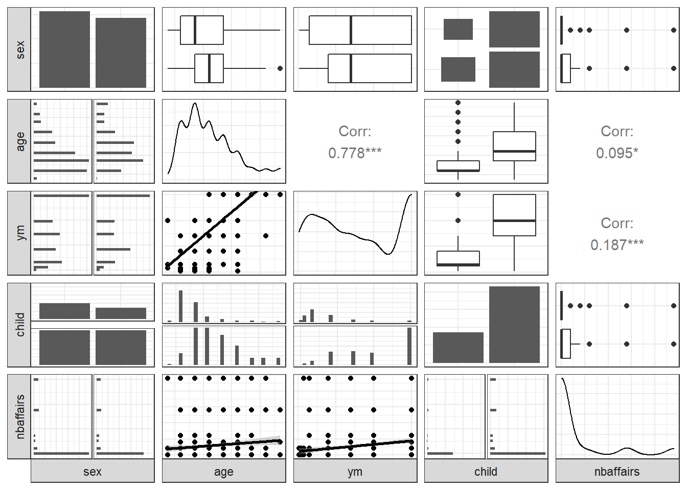
Fair2 <- Fair %>%
  select(religious:nbaffairs)
ggpairs(Fair2, lower = list(continuous = 'smooth'),
           axisLabels = "none",
           switch = 'both')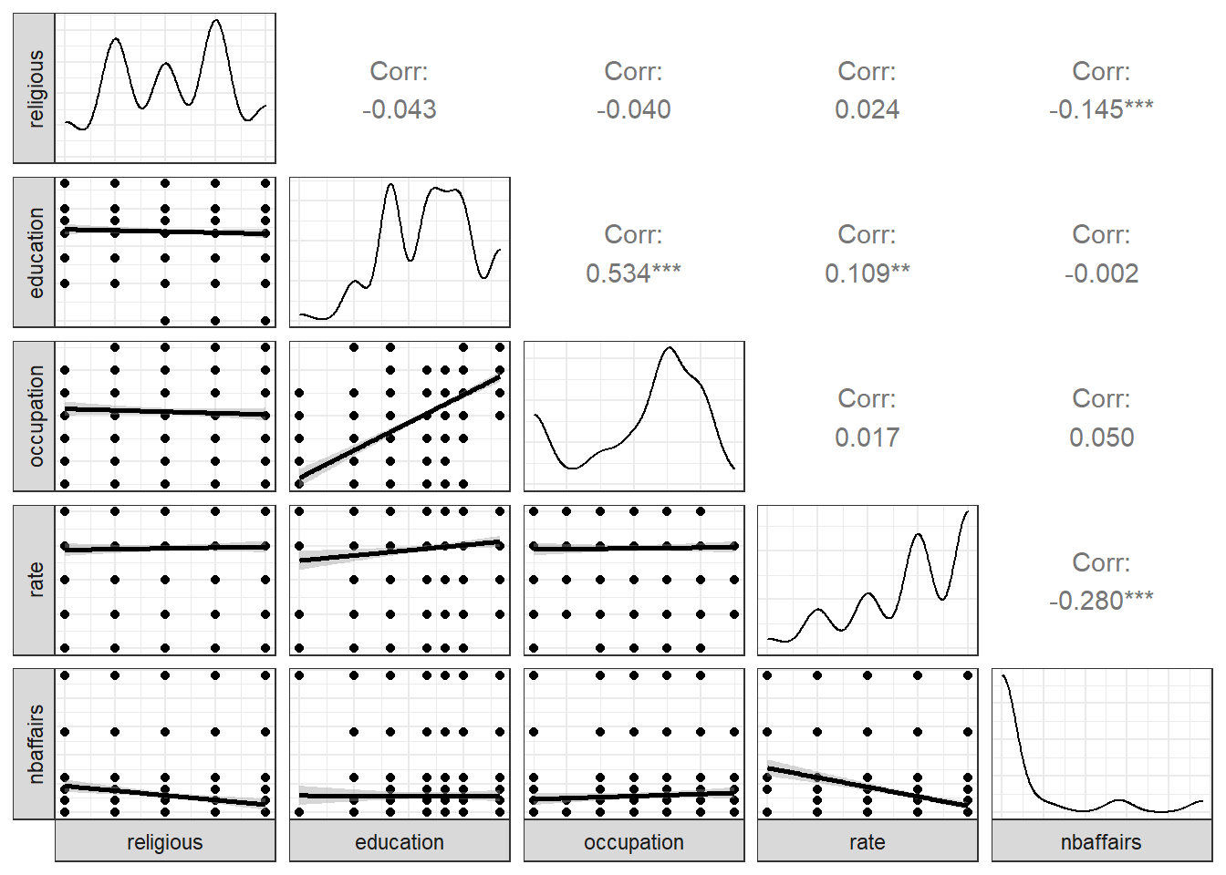
Exercise
- Study the data. Learn about the measures by looking at Fair in the help tab of R studio.
- What do the scatterplot matrices shown above tell us?
- Can you just run a regression on it as is? Try predicting nbaffairs from the remaining 8 variables in Fair (not Fair1 or Fair2), using the same syntax in the Swiss data. Does it work? What do the results suggest?
affairReg <- lm(nbaffairs ~ ., data=Fair)
summary(affairReg)
##
## Call:
## lm(formula = nbaffairs ~ ., data = Fair)
##
## Residuals:
## Min 1Q Median 3Q Max
## -5.0503 -1.7226 -0.7947 0.2101 12.7036
##
## Coefficients:
## Estimate Std. Error t value Pr(>|t|)
## (Intercept) 5.87201 1.13750 5.162 3.34e-07 ***
## sexmale 0.05409 0.30049 0.180 0.8572
## age -0.05098 0.02262 -2.254 0.0246 *
## ym 0.16947 0.04122 4.111 4.50e-05 ***
## childyes -0.14262 0.35020 -0.407 0.6840
## religious -0.47761 0.11173 -4.275 2.23e-05 ***
## education -0.01375 0.06414 -0.214 0.8303
## occupation 0.10492 0.08888 1.180 0.2383
## rate -0.71188 0.12001 -5.932 5.09e-09 ***
## ---
## Signif. codes: 0 '***' 0.001 '**' 0.01 '*' 0.05 '.' 0.1 ' ' 1
##
## Residual standard error: 3.095 on 592 degrees of freedom
## Multiple R-squared: 0.1317, Adjusted R-squared: 0.12
## F-statistic: 11.23 on 8 and 592 DF, p-value: 7.472e-15