7 visualization in R with ggplot
In the last chapter, we introduced data visualization, citing “vision-aries” including Edward Tufte and Hans Rosling, inspired works such as Minard’s Carte Figurative and Periscopic’s stolen years, as well as a few cautionary tales of misleading and confusing graphs.
Here, in playing with and learning the R package ggplot, we begin to move from consumers to creators of data visualizations.
As the first visualization in (Wickham and Grolemund 2016) reminds us, data visualization is at the core of exploratory data analysis:
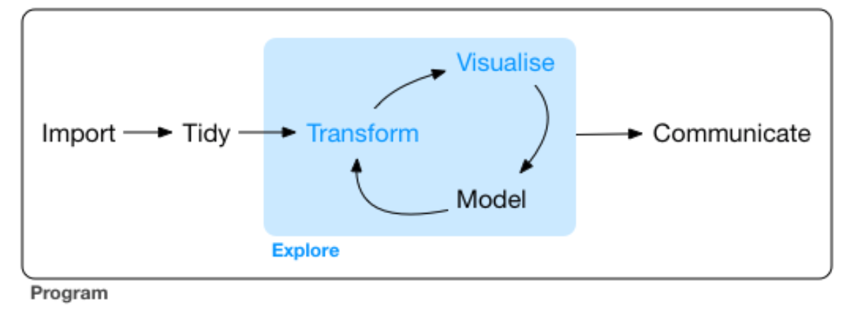
Fig 7.1: Data visualization is at the core of data analysis ((Wickham and Grolemund 2016))
In the world of data science, statistical programming is about discovering and communicating truths within your data. This exploratory data analysis is the corner of science, particularly at a time in which confirmatory studies are increasingly found to be unreproducible.
Most of your reading will be from Chapter 3 of (Wickham and Grolemund 2016), this is intended only as a supplement.
7.1 a picture > (words, numbers)?
The chapter begins with a quote from John Tukey about the importance of graphs. Yet there is a tendency among some statisticians and scientists to discount graphs, to consider graphic representations of data as less valuable than statistical ones. It is true that, because there are many ways to graph data, and because scientists and data journalists are humans with pre-existing beliefs and values, a graphical displays should not be assumed to simply depict a singular reality. But the same can be said about statistical analyses (see Chapter 8).
To consider the value of statistical versus graphical displays, consider ‘Anscombe’s quartet’ (screenshot below, live at http://bit.ly/anscombe2019):
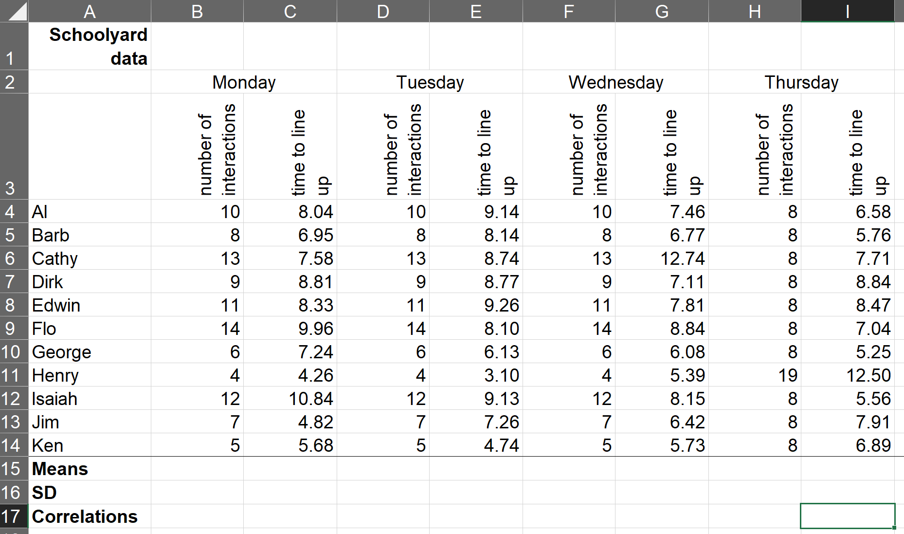
Table 7.1: An adaptation of Anscombe’s “quartet” (Anscombe 1973)
Exercise 7_1 Consider the spreadsheet chunk presented above, which I am characterizing as data collected on a sample of ten primary school children at recess on four consecutive days. Working with your classmates, compute the mean, standard deviation, and correlation between the two measures for one day. Share your results with the class.
The four pairs of variables in (Anscombe 1973) appear statistically “the same,” yet the data suggest something else. Later, we’ll try to plot these. Perhaps graphs can reveal truths that statistics can hide.
Exercise 7_2 The anscombe data is included as a library in R. Can you find, load, and explore it?
7.2 Read Hadley ggplots
In class, we will review and recreate the plots in section 3.2 of (Wickham and Grolemund 2016) and exercises through 3.4.
Savor this section, reading slowly, and playing around with the RStudio interface. For example, read about the mpg data in the ‘help’ panel, pull up the mpg data in a view window, and sort through it by clicking on various columns.
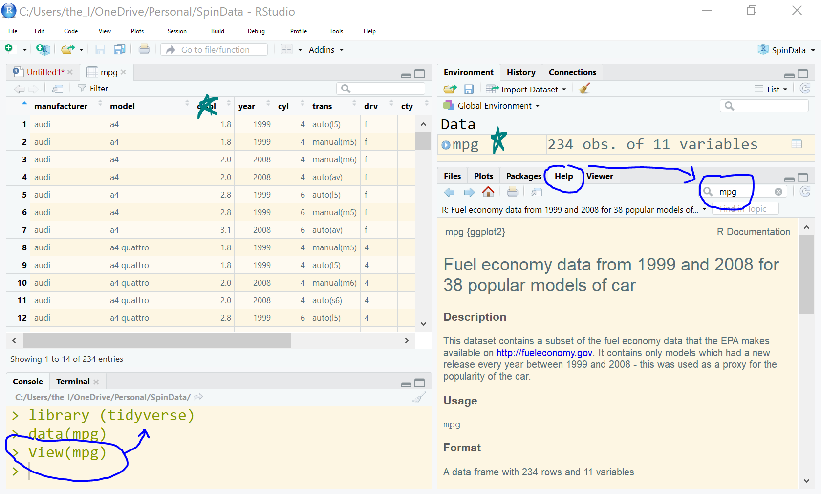
Fig. 7.2: A screenshot from RStudio, showing the mpg dataset
7.3 exploring more data
Explore the Gapminder data https://cran.r-project.org/web/packages/gapminder/README.html
Choose one of the datasets in R, pull out a few variables, and explore these.
Try to make a cool graph - one that informs the viewer, and, to paraphrase Tukey, helps us see what we don’t expect.
Try several different displays. Which fail? Which succeed? Be prepared to share your efforts.
Don’t be afraid to screw up. Each mistake you wisdom.